RE-BRANDING BLUE TONGUE
Services Provided
Brand Strategy
Identity
Language and Communication
Brand Structure
Photography
Web Design (only)
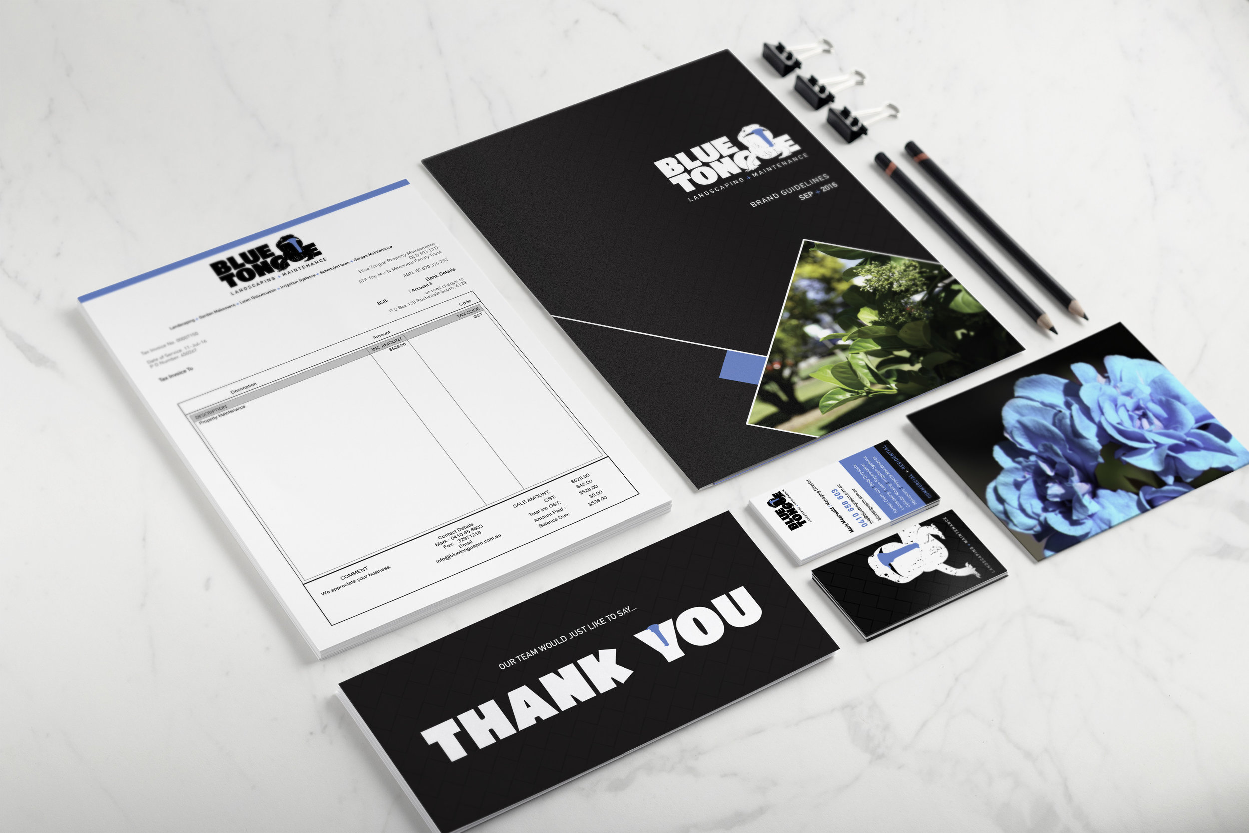
Promotional Material
Vehicle Signage
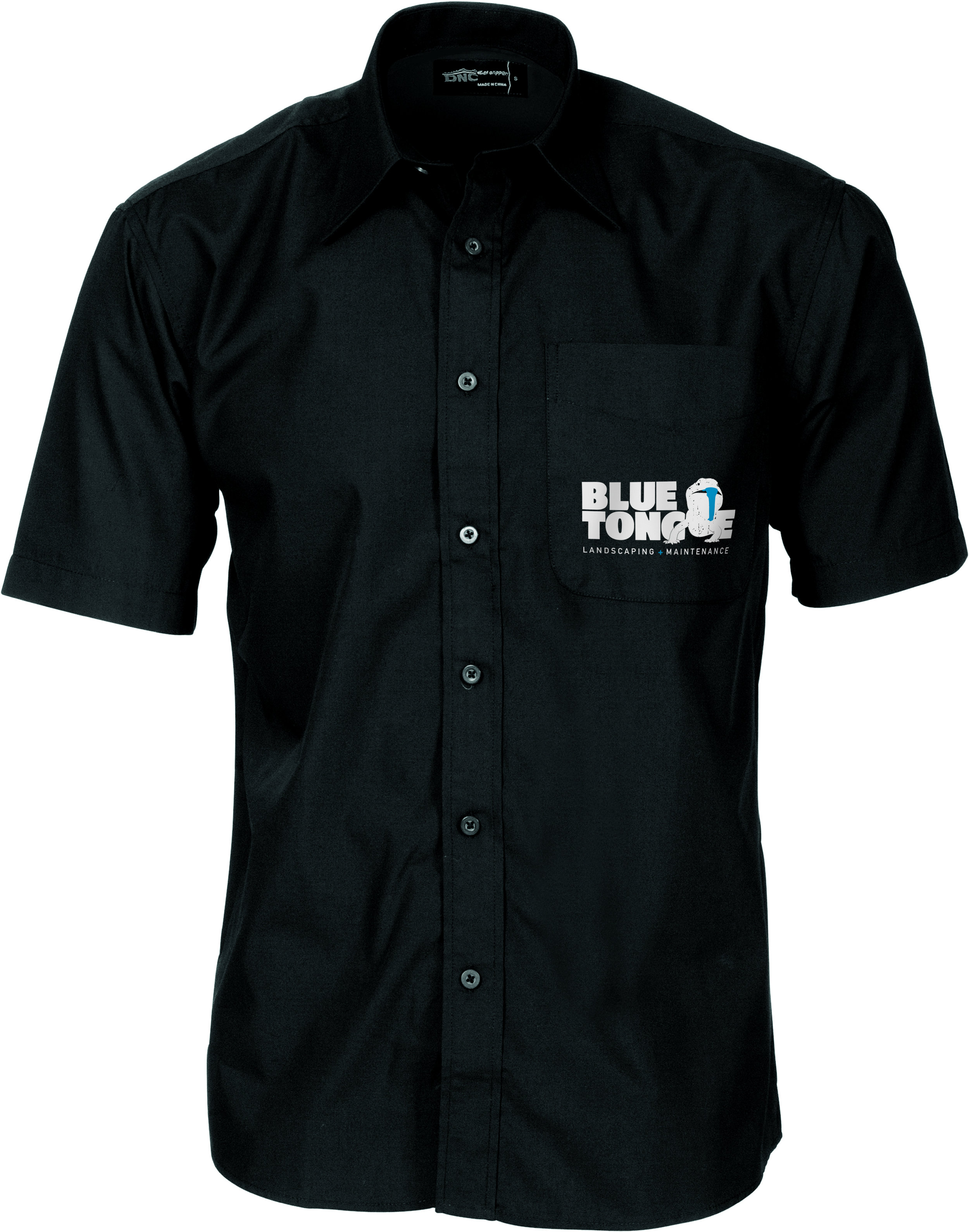
Uniforms
Blue Tongue Property Maintenance is a family run business which commenced in January 2001. It has since established itself as a first-class commercial and residential lawn and garden maintenance company.
When developing the Blue Tongue strategy, it became evident that Marks (Owner) primary business was in both commercial and residential. When we dug a little deeper we found the primary of his business was actually commercial businesses. With this as our main focus, we developed a brand that communicated in the right tones and languages through all elements and touch points of the Blue Tongue brand.
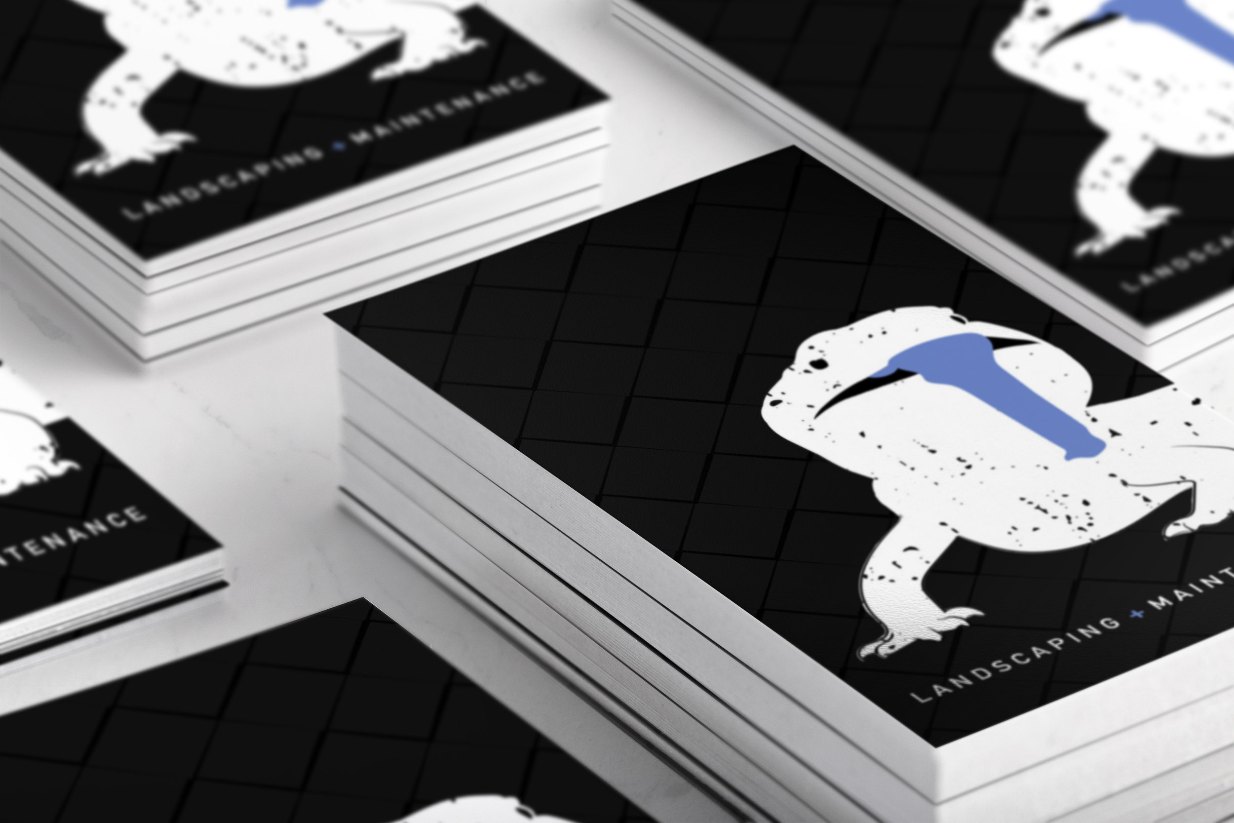
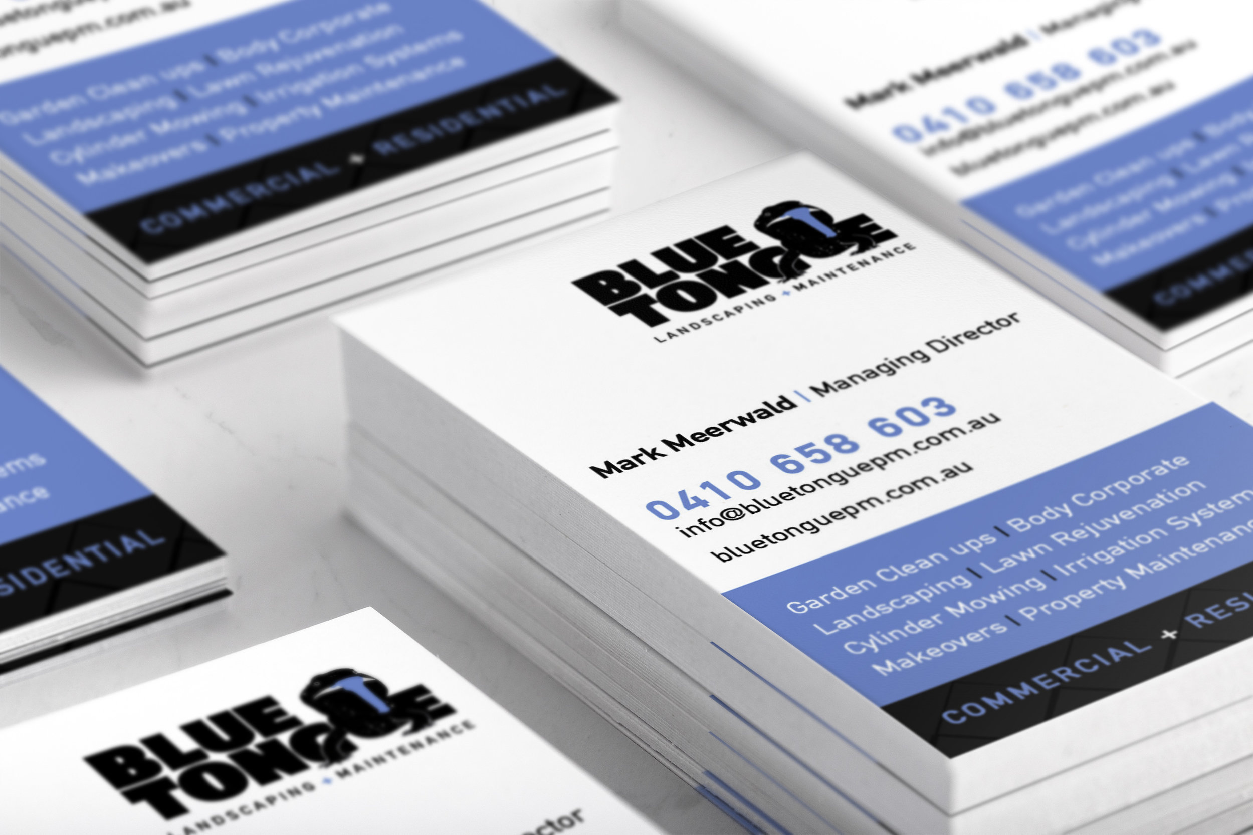
The visual components to the brand were created to leave a memorable and simple image to remember. We first developed a colour palette, blue being the obvious choice it became about what shade of blue would both reflect the values and quality of the service but also what would appeal the most to a commercial market? The answer was a light sky blue. This colour is both modern and fresh and provides viewers with another point of recall to the brand. The logo itself what to reflect a simple Blue Tongue image, the goal to visually display the words 'blue' and 'tongue' with images to once again assist people with recalling the brand, thus making it simple for people to refer and talk about Marks quality service.